


ISSUE 課題
- Supporting producers nationwide who lost restaurant sales channels due to the pandemic
- Limited awareness of the CtoC service directly connecting producers and consumers
- Lack of a consistent and unified brand image through visuals and messaging
- Need for rapid TV commercial production and broadcast alongside brand renewal
STRATEGY 戦略
Empathy-driven branding connecting producers and consumers
<Objective>
Clearly communicate Pocket Marche’s social significance and uniqueness through empathy-driven branding that narrows the emotional distance between producers and consumers.
<Approach>
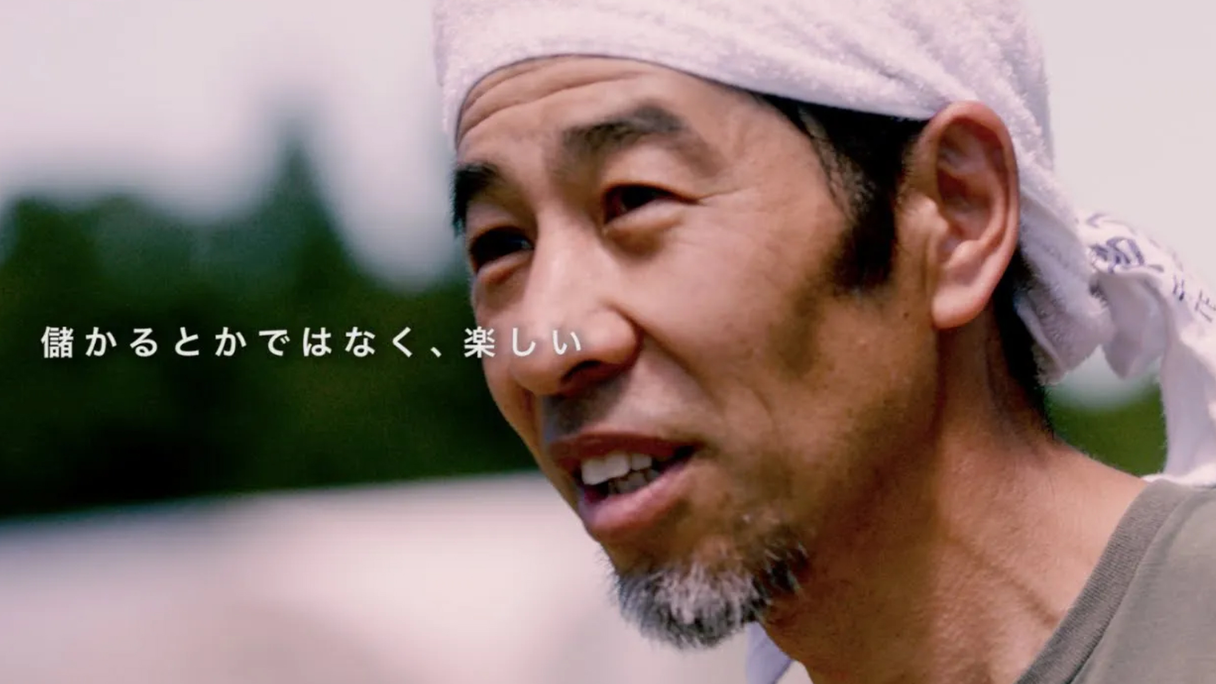
- Visualize the stories behind food by depicting producers’ realities through simple messaging and documentary-style video
- Redefine the brand “face” via a refreshed logo
- Reconstruct a comprehensive visual identity (logo, copy, tone) consistent across TV commercial, logo, and all branding elements
PLANNING 企画
Connecting producers’ “feelings” with your “deliciousness”
- On-site documentary coverage of producers in Fukushima, Ibaraki, Chiba, and other regions nationwide
- Produced a documentary-style TV commercial focusing solely on producers’ voices and natural scenery, avoiding excess direction
- Developed brand copy: “Connecting producers’ ‘feelings’ with your ‘deliciousness’.”
- Created a new brand logo designed for harmony with video and multi-channel use (TV, web, other media)
- Established a brand visual identity guideline (logo, font, color, tone) to ensure consistent future brand management
CREATIVE クリエイティブ
A warm brand tone connecting consumers and producers
- Video Design: Centered on authentic narratives from producers, with no background music or narration to let their words resonate naturally
- Logo Design: Adopted forms and colors evoking nature, human touch, and warmth
- VI Design: Defined brand tone as “honest,” “rustic,” and “warm,” applied consistently across video, web, app, and print
ROLL 担当領域
- Brand renewal strategy planning
- Brand logo and visual identity (VI) design
- TV commercial planning and production (structure, script, filming, editing)
- Brand copy and video narration development
- Media strategy planning for nationwide spot broadcast
- Support for PR and SNS activation initiatives