


ISSUE 課題
- The need to redesign for the modern era while preserving the trust and prestige of a long-established sushi shop.
- The requirement for a visual message that promotes the special location of the fish market, highlighting its role as a symbol of freshness and reliability.
STRATEGY 戦略
A Logo That Inherits Tradition and Builds the Future.
Reconfirming the identity of this long-established sushi shop, we condensed its legacy of “trust built over years in the market” and its “pride in freshness” into a new brand identity. This initiative aims for a unification of the brand as it approaches its 150th anniversary, emphasizing the unique experience of “dining in the market.”
<Objective>
- Balance the heritage and gravitas of 146 years of history with a sense of modern accessibility.
- Visually express the strength of its location within the fish market and its high level of freshness.
- Maintain trust with long-time patrons while making the brand approachable for new customers.
<Target Audience>
- Existing patrons of Sushi Sagamiya (long-standing customers)
- New customers, including market visitors and tourists
<Approach>
- Redesign the logo to balance heritage and modernity.
- Research traditional calligraphy and design roots to reflect the founding philosophy.
- Develop a noren design that captures the bustling, lively atmosphere of the fish market.
- Through the logo and noren, establish Sushi Sagamiya as a symbol of freshness and trust.
PLANNING 企画
Visual Branding that Conveys “Inheritance of Tradition” and “Freshness as a Symbol”
- Make the unique location within the fish market — a symbol of freshness and trust — visible through design.
- Unify the tone across the logo, noren, and copywriting to create a seamless brand world.
- Respect the 146-year heritage while creating a modern impression that will carry the brand into its next 150 years.
CREATIVE クリエイティブ
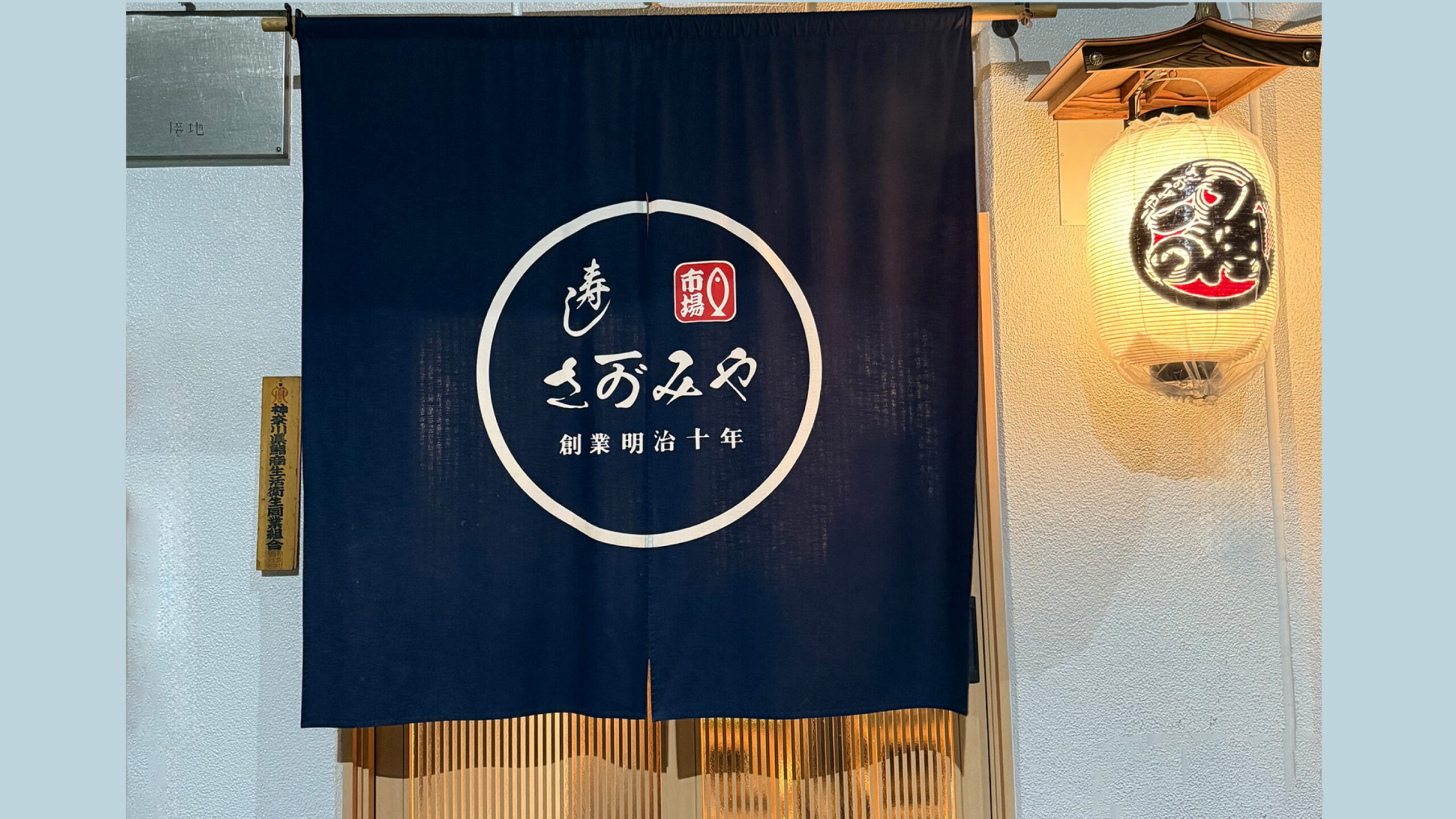
- Logotype: Redesigned with a traditional calligraphic base, making it bold, legible, and clearly recognizable.
• Symbol:A concise, impactful design capturing the heritage of the fish market and the pride imbued in the name “Sagamiya.”
• Tone & Manner:The deep indigo blue reminiscent of the deep sea combined with crisp, fresh fish whites — merging dignity and warmth.
• Noren Design: A bold use of space that captures the vibrancy of the market, combined with confident lettering that refreshes the shop’s exterior.
ROLL 担当領域
- Brand Strategy Development
- Logo Design & Development
- Noren Design and Production
STAFF スタッフ
- Creative Director 的場 タカキ
- Creative Director 的場 タカキ
- Creative Director 的場 タカキ
- Creative Director 的場 タカキ